Your website should be your best salesperson. It works 24/7, never calls in sick, and can talk to thousands of people at once.
But what if, instead of welcoming people in, your website is actually slamming the door in their face?
A lot of small business owners set up a website and just... leave it. They think the job is done. But a bad website isn't just invisible, it's actively damaging your brand. It's like having a shop with a broken front step, a roof that leaks, and no one at the till.
People will just turn around and leave.
You might be making some of these common mistakes right now, and they could be costing you a lot more than you think.
When a new visitor lands on your homepage, they have one immediate question: "Am I in the right place?"
They need to know, in seconds, what you do and who you do it for.
This is where so many sites fall down. They're filled with vague headlines like "Welcome to Our Website" or corporate jargon like "Integrated Solutions for Modern Enterprises."
What does that even mean?
If a potential customer can't immediately understand what you do, they won't stick around to investigate. They'll assume you can't help them and leave. Your main headline should be crystal clear.
One is fluff, the other makes an immediate connection. If your message is confusing, your customer is gone.
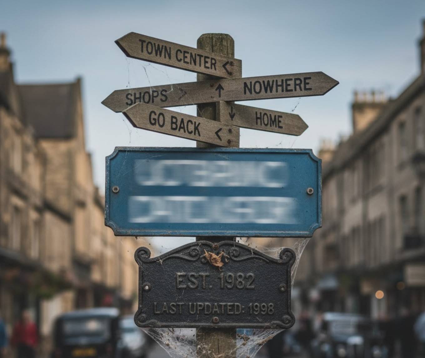
Nothing kills trust faster than a website that's a ghost town.
Think about it. A customer lands on your site, looking for help. They click on your 'Blog' or 'News' page to see if you know your stuff, and the last post is from three years ago. Or they go to your 'Opening Hours' page, and it still has your old address.
What does this communicate? It screams "we're not paying attention." At worst, it makes them wonder if you're even still in business.
Your website isn't a digital brochure you print once and forget about. It's a living, breathing part of your business. If it's full of cobwebs and out-of-date information, you're not just missing an opportunity, you're actively telling new customers to go away.
A new visitor lands on your homepage. What happens next?
Is it immediately obvious what you do? Is it clear where they should click? Or are they just faced with a wall of text, a confusing menu, and a blurry photo from 2017?
A website's job is to guide a visitor to a goal.
This is called a 'Call to Action' (CTA), and it's the most important part. If a customer is confused, they won't buy. They'll just get frustrated and leave. A good, professional design isn't just about pretty colours; it's about creating a clear, simple journey that leads the customer from "I'm just looking" to "I'm ready to talk."
If your website is guilty of any of these, it's not a salesperson, it's a liability. It's not just sitting there doing nothing; it's actively sending your customers straight to your competition.

We're proud to have been recognised as Wales' Most Trusted Web Design & Development Company for 2025. This award reflects our commitment to delivering exceptional digital solutions and outstanding client service that sets the standard for excellence.
