Although having a mobile responsive, or even mobile-first website is a big part of creating a mobile-first web presence, mobile searches for your business begin before, and can extend beyond, just visiting your website.
This article will cover how to optimize your business’s online presence for a whole customer journey on mobile.
If you operate a local business, then by far the most important keywords for your website is the term: “[your business] near me”. For example, if you have a dental practice, then a large proportion of new patients finding you online will do so by searching “dentist near me”.
So long as a searcher is in your local area, then you will want your practice appearing at the top of Google for such a search.
Appearing at the top of Google for such searches is particularly important in establishing a mobile-first web presence for two reasons.
Firstly, searches suffixed with “near me” are particularly popular among searchers using mobile devices. In addition to this, when mobile users make such a search they are served up a Google Map with a list of local businesses of their searched category.
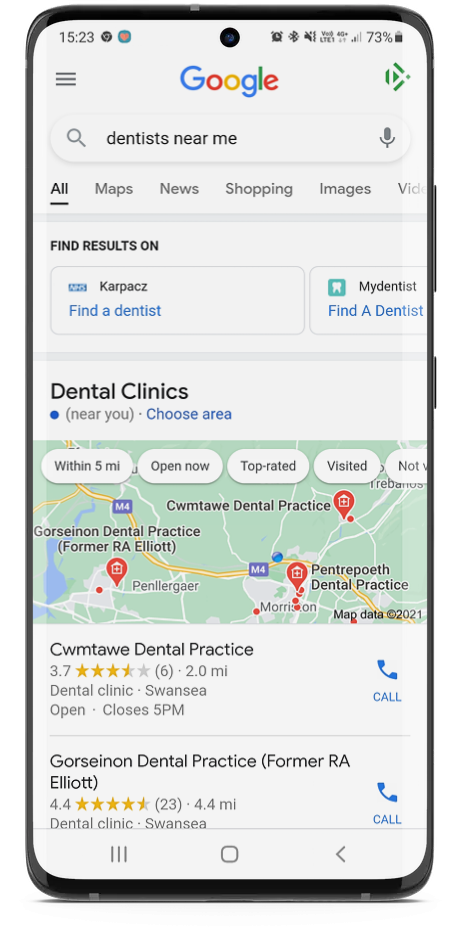
This image shows what someone sees when they search “dentist near me” on their phone
Your aim here should be to have your business be at the top of this map listing.
It’s important to know that your position on the map listing for “near me” searches is not determined by your website itself, but rather the information on your Google My Business profile.
To give yourself the best chance of ranking well in the map for “near me” searches you should make sure that:
The latter is incredibly important in creating a strong mobile-first web presence. The number of Google reviews that your business has, and its average rating, is immediately visible for people who make a search for a local business on their phone. These ratings act as “social proof” for the quality of your business, with many potential customers basing their buying decisions on these ratings.
While the first element that you should consider when creating a mobile-first website is its design and usability, many people overlook the way that the content on a website affects user experience on a mobile device.
As screen space is smaller, copy elements on a website seem more long-winded and harder to digest for a mobile user. The principle of “less is more” needs to be followed when creating the copy for your website.
You should also think about the interplay between your website’s design and content. Walls of text that take several scrolls on a phone to get through are off-putting to phone users. Break text up as much as you can to leave breathing room between paragraphs.
Once you have done the hard work in getting a mobile user onto their website, it’s imperative that you make it as easy as possible for them to make a booking, get in contact, or make a purchase off you with as little difficulty as possible.
Ideally, a user should be able to perform these actions without leaving their phone.
Integrating your website with an online booking platform, responsive eCommerce backend, or adding a “click to call” button is vital to achieving this mobile-first web presence, making each step of the buying journey seamless on a mobile device.
This article was contributed by Oli Graham, Marketing Manager at copywriting company RightlyWritten.


We're proud to have been recognised as Wales' Most Trusted Web Design & Development Company for 2025. This award reflects our commitment to delivering exceptional digital solutions and outstanding client service that sets the standard for excellence.
